A design system built so a government product can't quietly drift.
As one national product grew from onboarding into dashboards, finance and support, every new screen was a chance to re-invent a button or re-pick a colour. I built the system underneath it — primitives feeding semantic tokens feeding components — so consistency and accessibility are decided once, in the system.
- Role
- Senior Product & UX/UI Designer — system architecture, tokens, components, governance
- Timeframe
- 2025–26
- Context
- National government product · Digital India Corporation, under MeitY
- Team
- Design lead · four module teams · platform engineering
The token system is shown in full; product screens use dummy data and are shared with permission. Happy to walk the architecture in conversation.
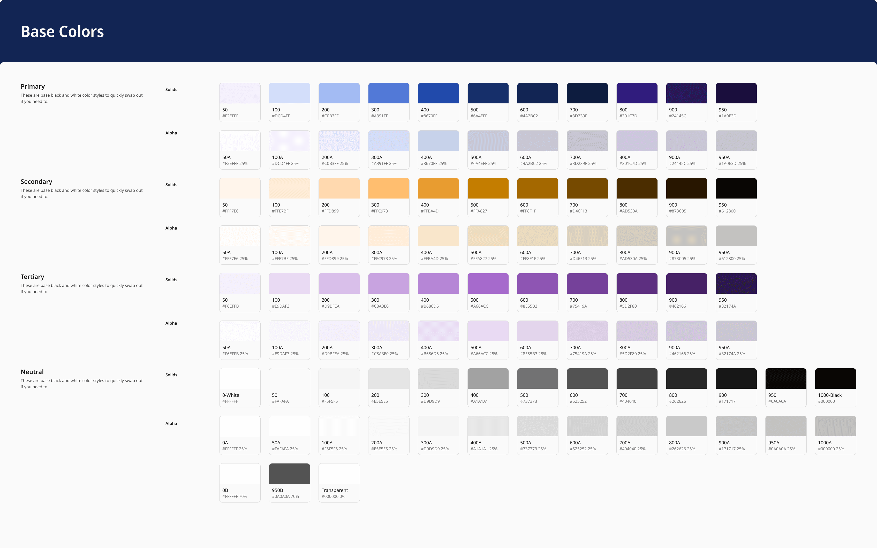
The foundation layer: every colour the product is allowed to use, named for what it is rather than where it gets used.
In use, 2026Nobody decides to break a product. It drifts one button at a time.
A government product never stays one product.
What began as an onboarding flow grew into dashboards, a finance module and a support system. Every new surface was a fresh chance to re-invent a button, re-pick a blue, re-check a contrast ratio, and ship the fourth slightly different version of the same thing.
Across enough teams and enough quarters, that drift is how a product stops feeling like one product. The response most places reach for is a review step. But reviews catch what already shipped — and they only catch it while someone senior is still in the room to care.
- 01The same button redrawn a little differently on every screen.
- 02Contrast re-judged by hand, screen by screen — so accessibility passes in some places and fails in others.
- 03States nobody planned for — read-only, warning, error — improvised under deadline.
- 04Design files and production code slowly disagreeing, with no single source to settle it.
One base collection, everything downstream.
The system resolves in three tiers, and no screen is allowed to hold a raw value. That single rule is what makes the whole thing maintainable by people who were never in the original room.
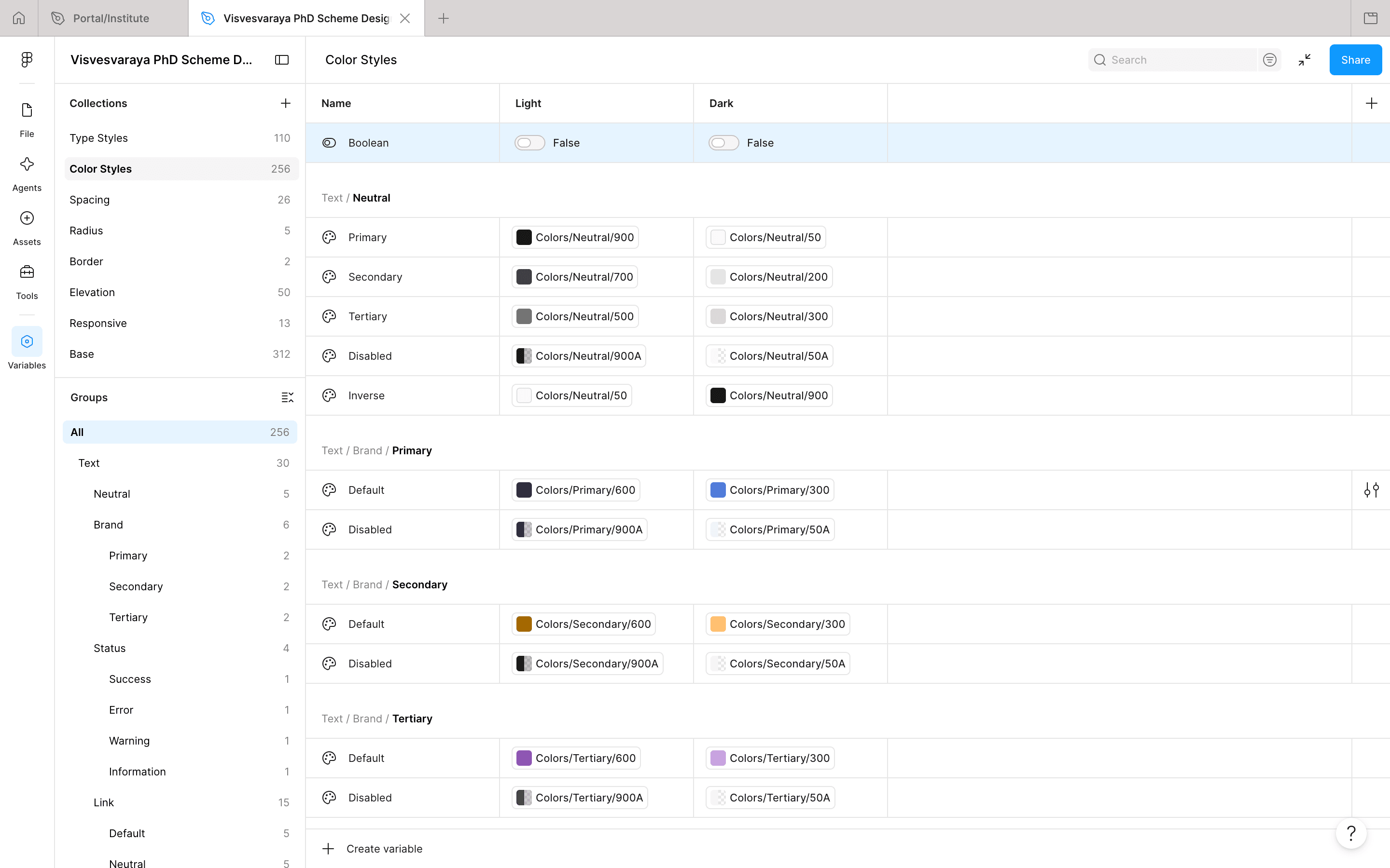
A styleguide describes decisions. A token layer enforces them.
Contrast is a property of the system, not a per-screen judgement.
Accessibility was being treated as a review step — which means it was being re-argued on every screen, by every designer, forever. So I moved the decision into the token layer. Colour roles map to base tokens per light and dark mode, so the accessible pairing is the only pairing the tokens expose. Get it right once and every surface inherits it; there is no convenient way to ship an inaccessible combination.
The ramps stayed generous; what got constrained was which pairs are legal. Teams gained range in the places range mattered and lost the ability to fail an audit.
Only if themes are drawn rather than resolved. Because roles hold the meaning, dark mode is a value swap — a component ships once and behaves in both.
In light mode every role resolves to a base token that already clears AA against the default surface. A designer picks the role; the ratio is not theirs to get wrong.
Light mode · AA or better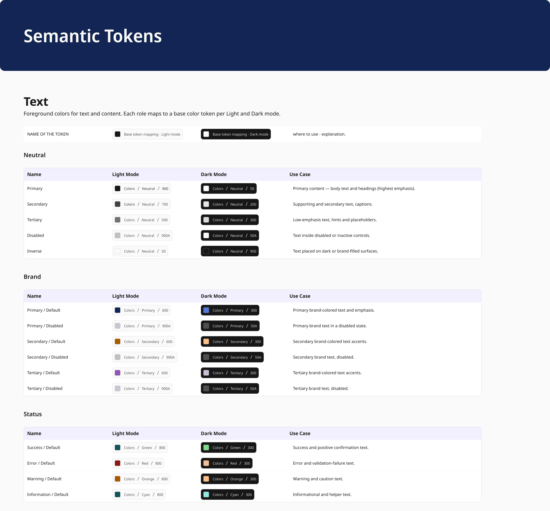
What the system refuses to allow.
- 01No raw value in a screen. Ever.
- 02Name a token for its role, never its appearance.
- 03A component isn't done until its worst state is designed.
- 04Test on real assistive tech and low-end phones, not simulators.
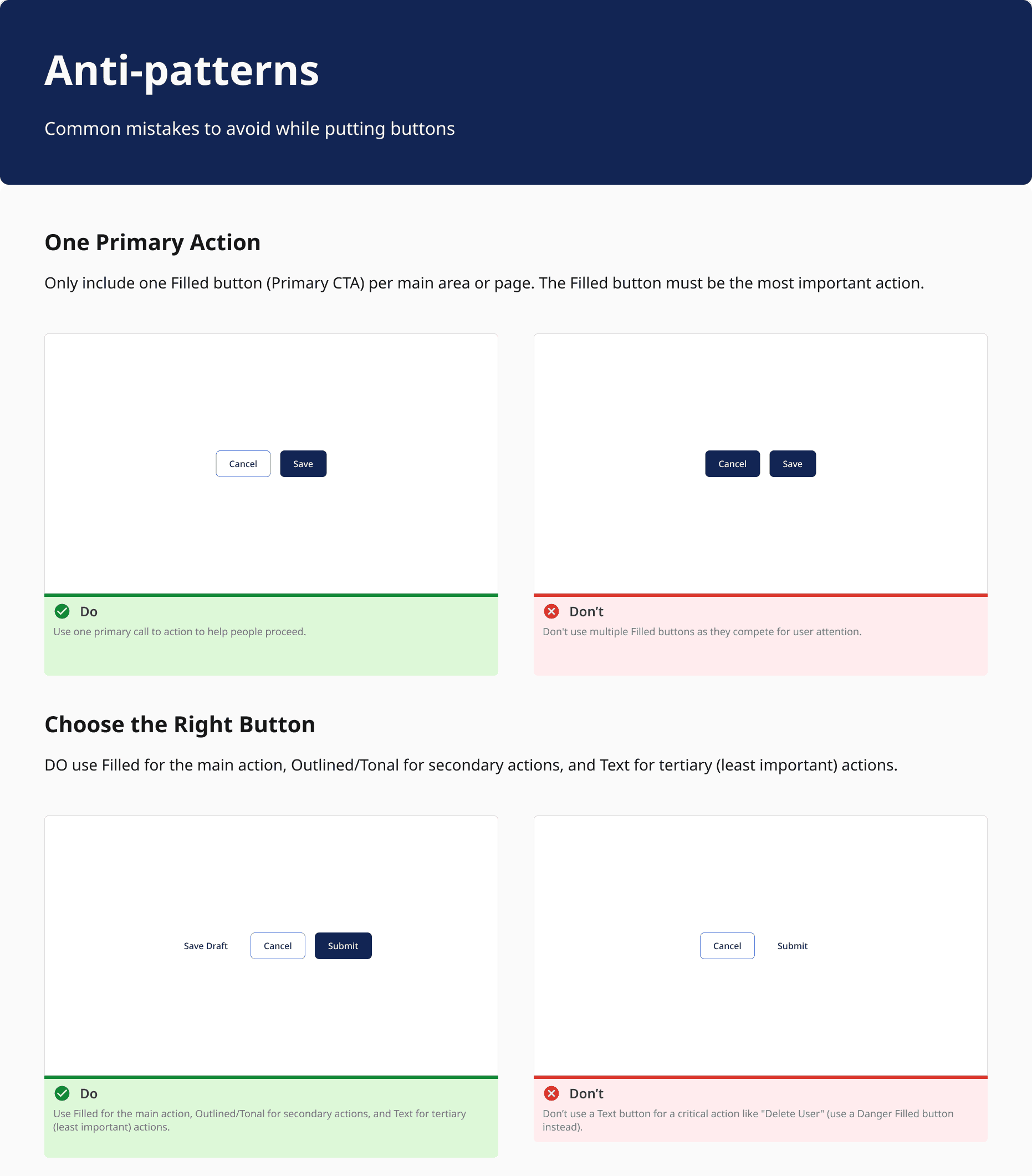
- 05Ship the judgement with the part — guidance and anti-patterns included.
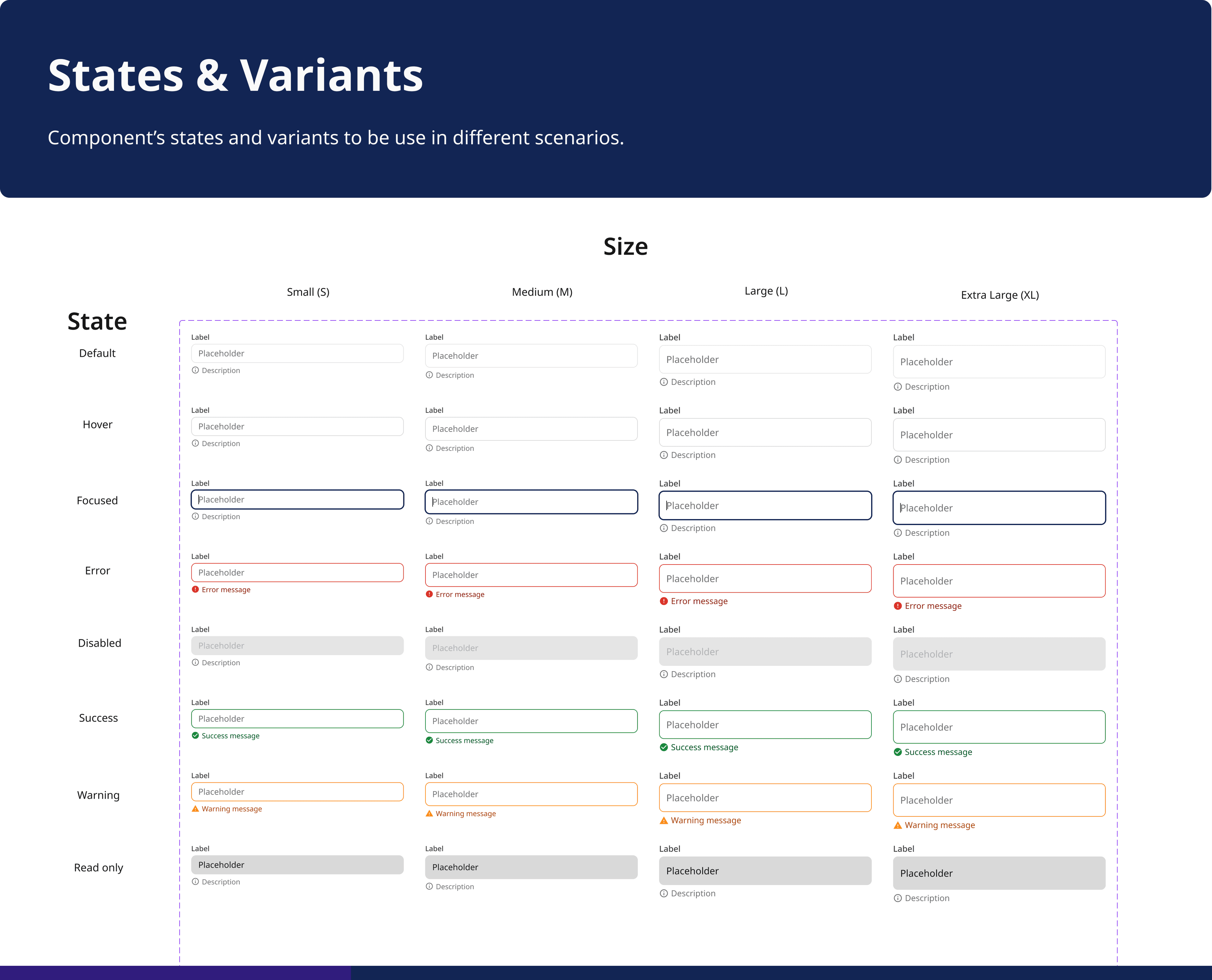
Every state a government form actually meets.
Most component libraries ship the happy path and improvise the rest. Government forms don't get that luxury: read-only fields, server-side warnings, validation errors and disabled states are the everyday, not the edge. So each component ships with the full set — default, hover, focused, error, disabled, success, warning, read-only — across sizes, designed once.
- Default
- Hover
- Focused
- Error
- Disabled
- Success
- Warning
- Read-only
Built to survive a second and third team.
Three things were designed specifically for the day I'm not there: variables so design and code share one source instead of a screenshot; semantic roles so a rebrand is a token change rather than a redraw; and states documented so the hard cases are settled centrally instead of re-improvised by whoever ships next.
It isn't only components, either — it's the rules for using them. Each pattern ships with usage guidance and explicit anti-patterns, so the designer who joins next year inherits the judgement, not just the parts.
- Colour, type, spacing, radius, elevationOne base collection of 312 variables — a single source design and code both read.
- Light and dark themesTwo resolutions of the same contract, not two designs to maintain.
- Handoff spec per componentTokens, states and behaviour written down where engineers already work.
- Screen-reader & keyboard passesReal devices and low-end phones — whatever broke there became the spec.
Onboarding and self-serve support shipped on this system and produced the results in the Visvesvaraya PhD scheme case. The dashboards and finance surfaces are designed on it now, rolling out in phases as engineering capacity allows.
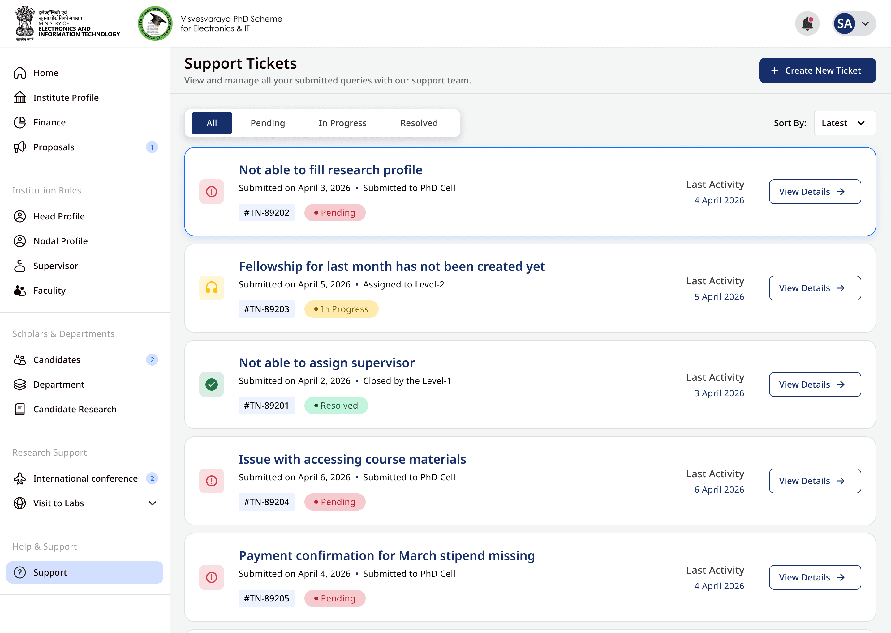
What the system settled.
Not a component count — a list of arguments that stopped happening. Each one used to cost review time on every screen, in every module, every quarter.
The best measure of a design system is how few decisions it leaves open.
What I took from it.
The interesting part of a design system isn't the components — it's the decisions you get to stop re-making. Contrast, spacing, states, the meaning of danger: decided once, in one place, inherited everywhere.
On a government product that has to stay accessible and consistent for years, across teams that rotate, that isn't polish. It's the only way it holds together at all.
The token system is shown in full; the one product screen uses dummy data and is shared with permission. Happy to walk through the token architecture in more depth in conversation.